Sans-serif fonts look “cleaner”
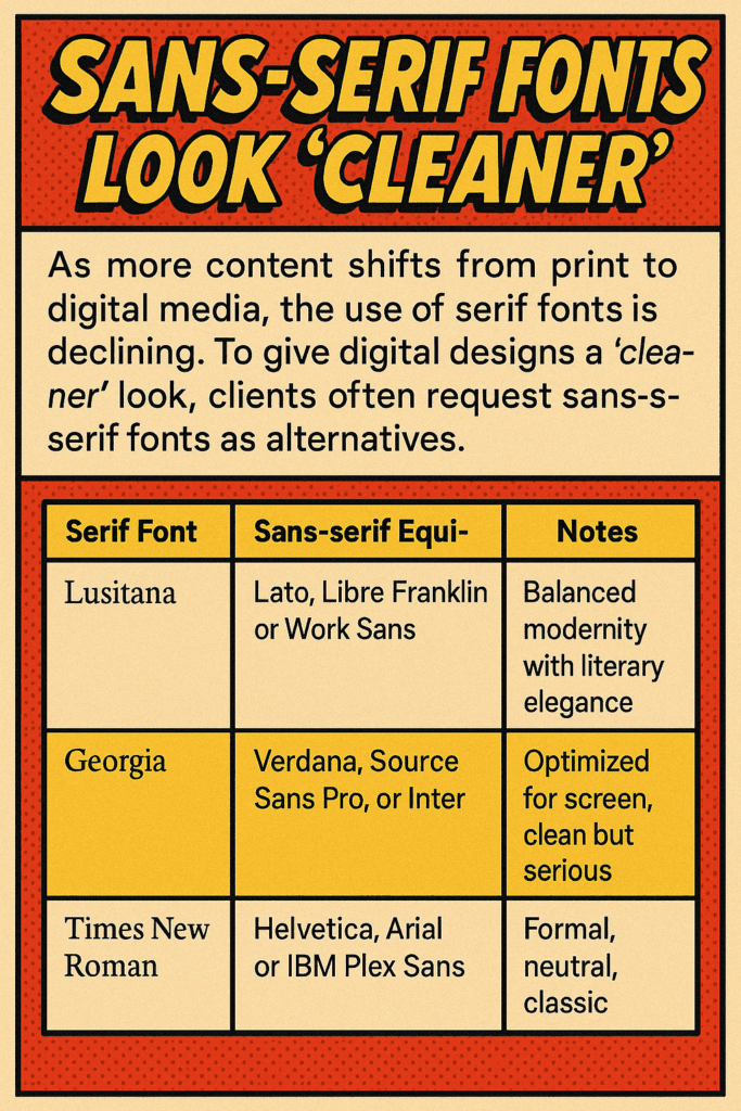
The days of “flow” guided by otherwise “clutterful” serif fonts are waning as analog print materials secedes evermore to digital.
A client recently requested a “cleaner” look for their website overall. Comparison to examples immediately revealed “cleaner looking” sans-serif was an easy substitute for quick results.
| Serif Font | Sans-serif Equivalent | Notes |
| Lusitana | Lato, Libre Franklin, or Work Sans | Balanced modernity with literary elegance |
| Georgia | Verdana, Source Sans Pro, or Inter | Optimized for screen, clean but serious |
| Times New Roman | Helvetica, Arial, or IBM Plex Sans | Formal, neutral, classic |

The Evolution of Serif and Sans-Serif Fonts: A Typographic Study
Historical Foundations
Serif Fonts
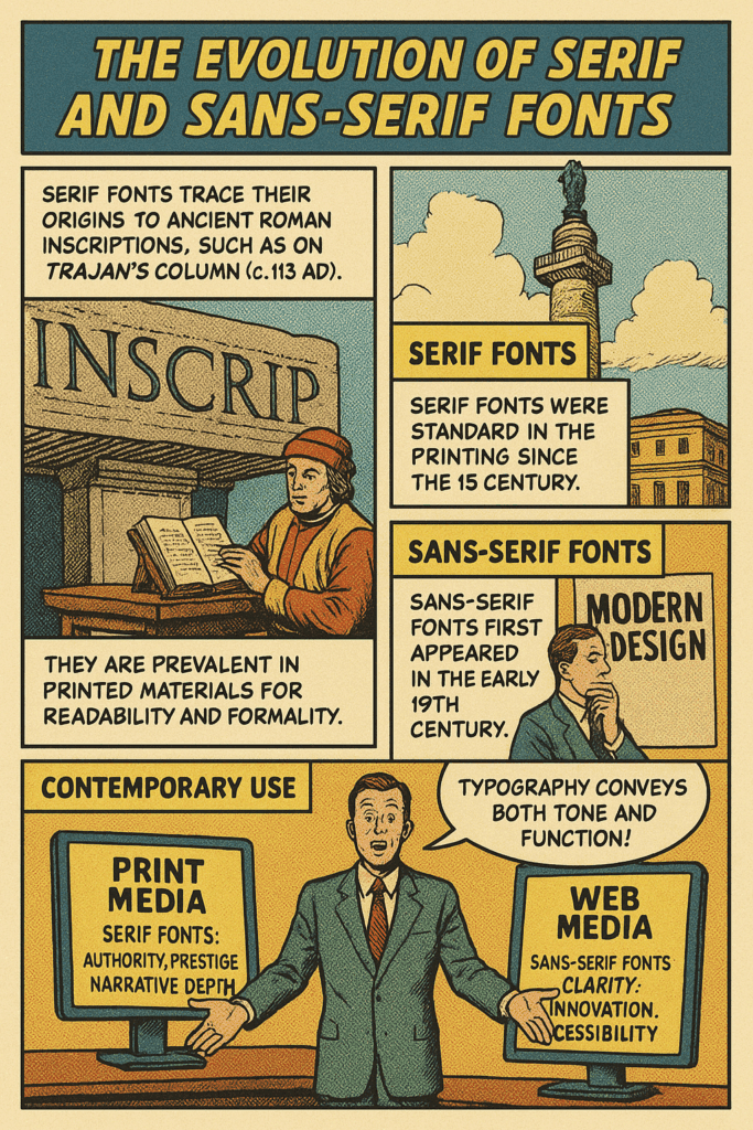
Serif fonts trace their origins to ancient Roman inscriptions, particularly the flared endings visible on monumental lettering, such as on Trajan’s Column (c. 113 AD). These small decorative lines—serifs—are believed to have originated from brush strokes used before chiseling the letters into stone.
With the invention of the printing press in the 15th century, serif fonts became the standard in Western publishing. The first books were printed in Gothic script (Blackletter), but Renaissance humanists preferred Roman-style lettering for its classical clarity. Influential type designers in this lineage include:
- Claude Garamond (16th century), whose work became synonymous with elegance and legibility.
- William Caslon (18th century), whose fonts were used in U.S. colonial-era printing.
- Giambattista Bodoni and Firmin Didot (late 18th century), who introduced high-contrast “modern” serifs.
- Stanley Morison, who commissioned Times New Roman in 1931 for the British newspaper The Times.
Serif fonts remain prevalent in printed materials, such as newspapers, books, and legal documents, due to their readability and formal appearance.
Sans-Serif Fonts
Sans-serif fonts—those without serifs—were introduced in the early 19th century. The earliest known example in print was Caslon’s Egyptian (1816), though it was initially met with skepticism and referred to as “grotesque.”
Throughout the 20th century, sans-serif fonts gained prominence in advertising, signage, and eventually interface design. Key developments included:
- Akzidenz-Grotesk (1898), one of the first widely used sans-serifs.
- Helvetica (1957, Max Miedinger), which became iconic for its neutrality and modernism.
- Univers (1957, Adrian Frutiger), offering a systematic type family with consistent structure.
The Bauhaus movement (1919–1933) had a profound influence on sans-serif design. Designers such as Herbert Bayer emphasized geometric simplicity and functionality, often avoiding uppercase letters entirely.
Digital vs. Analog Typography
Print Typography
In print, typography is crafted with precise control over kerning, ligatures, line length, and justification. Serif fonts were traditionally favored in this context due to their perceived readability in dense, long-form text.
Printed material allowed for high-resolution detail, enabling subtle stylistic features. Typeface choices carried cultural weight, often signifying professionalism, prestige, or literary quality.
Digital Typography
On screens, particularly in early computing, sans-serif fonts were easier to render clearly at low resolutions. This gave rise to web-safe and screen-optimized fonts like:
- Verdana and Georgia (Matthew Carter, 1996) — designed for legibility at small pixel sizes.
- Arial — a Helvetica alternative bundled with Windows.
- Roboto, Open Sans, and Inter — contemporary digital-native sans-serif fonts.
Today’s high-resolution displays and OpenType features allow for richer typographic expression online. Yet sans-serif fonts continue to dominate UI/UX and web environments due to their clarity and minimalism.
Font Foundries and Design Movements
Adobe Systems
Founded in 1982, Adobe played a central role in digital typography through the development of PostScript fonts, Adobe Type Manager, and later the OpenType format in collaboration with Microsoft. Adobe’s font library includes:
- Adobe Garamond
- Minion
- Myriad
- Source Sans / Source Serif Pro
Adobe’s typographic innovations enabled scalable vector fonts and cross-platform consistency.
Bauhaus Influence
The Bauhaus treated typography as a modern industrial craft. It rejected ornamentation and historicism, favoring geometry and efficiency. Its influence is evident in:
- Futura (Paul Renner, 1927) — inspired by circles and linear forms.
- Bauhaus 93 — a later display typeface inspired by Herbert Bayer’s work.
Bauhaus principles continue to shape UI design, branding, and editorial layouts in the 21st century.
Retro and Revival Movements
From the 1960s through today, designers have periodically returned to decorative, hand-lettered, or historically inspired fonts. Studios like:
- House Industries
- P22 Type Foundry
- The League of Moveable Type
These groups revived vernacular styles, psychedelic typography, and mid-century advertising aesthetics, blending nostalgia with digital craftsmanship.
Contemporary Use: Web vs. Print
| Attribute | Print Media | Digital/Web Media |
|---|---|---|
| Font Preference | Serif (e.g., Garamond, Baskerville) | Sans-serif (e.g., Inter, Roboto, Helvetica) |
| Readability Context | Long-form reading | Scanning, short bursts of content |
| Rendering Control | Full typographic control | Subject to browser/OS rendering engines |
| Resolution Dependence | Consistent DPI | Varies by device, resolution, and zoom |
| Responsive Typography | Not required | Essential for mobile and variable layout |
| Dominant Function | Authoritative, archival | Clean, interactive, and legible |
Conclusion
Typography is more than visual styling—it conveys tone, function, and even ideology. Serif fonts symbolize legacy, trust, and narrative depth. Sans-serif fonts signal clarity, innovation, and accessibility. As technology and culture evolve, so too does type design, balancing historical roots with digital imperatives.
Bibliography
- Bringhurst, Robert. The Elements of Typographic Style. Hartley & Marks, 1992.
- Kinross, Robin. Modern Typography: An Essay in Critical History. Hyphen Press, 1992.
- Lupton, Ellen. Thinking with Type. Princeton Architectural Press, 2004.
- Meggs, Philip B. A History of Graphic Design. John Wiley & Sons, 1998.
- Carter, Matthew. “Georgia and Verdana—Typefaces for the Screen.” Microsoft Typography, 1996. https://learn.microsoft.com/en-us/typography
- Adobe Fonts. “Font Stories.” https://fonts.adobe.com/
- The League of Moveable Type. https://www.theleagueofmoveabletype.com/
- House Industries. https://houseind.com/
- P22 Type Foundry. https://www.p22.com/
- Bauhaus Typography. https://www.bauhaus100.com/the-bauhaus/works/typography/

